The 1990s were a golden era of expansion, with all three major sports leagues adding teams. Unlike the Westward expansion of the 19th Century, this era of expansion featured considerably more teal, purple, and dinosaurs. These expansion teams threw down the gauntlet of garishness, and more established professional teams eagerly scooped it up and ran with it. Here’s a collection of some of the most over the top jerseys from that time period, a time that was truly the renaissance of teal.
1994-1995 Cleveland Cavaliers Jersey

Growing up a Cleveland Cavaliers fan, I didn’t think that these were that bad! I’ve since learned from non-native Ohioans that everybody else thought they were clown shoes. I’d call them dynamic; look how the blue crests across the chest like a wave. It paired perfectly with late career Shawn Kemp, who by the time he joined the Cavs was plenty buoyant enough to float atop that wave. My overall assessment of these is that they’re not on par with the classic late 80s and early 90s orange and blues, but I like them better than most of the wine and gold versions since. They’re fun and very of their time.
1995 Toronto Raptors Jersey

Bless the Toronto Raptors. Two years removed from the first Jurassic Park movie, they decided to go all in on dinosaurs. Anybody who follows the NBA today knows that they were ultimately vindicated, since the Raptors mascot is one of the most beloved in the league, but for most of the 1990s it looked woefully out of place. It’s hard to explain why in a league where teams were named after deer, wolves, and hornets, a dinosaur struck people as childish, but it did. If you really think about it, the raptor is the most ferocious of all mascots. In all seriousness, it’s Barney’s fault. The Raps shot for “Clever Girl” and landed among the “I love you’s.”
1995 Milwaukee Bucks Jersey
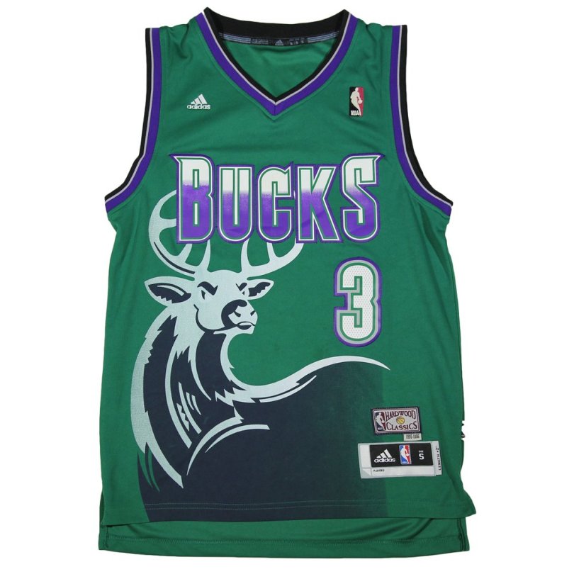
The current Milwaukee Bucks jersey is a thing of beauty, and the Bucks jerseys of the 1980s featured clean, classic designs. This makes it all the more disappointing when a search of the Internet reveals that there are no 1980s Bucks jerseys available anywhere. If you’d like to rock a Rick Smits, Ricky Pierce, or Terry Cummings jersey you’re out of luck, but if you want to drape your entire torso in deer, you’ll find that you have plenty of options. It also feels like draping yourself in deer in a region that reveres hunting season is asking for trouble.
1995 Vancouver Grizzlies Jersey

The grizzly itself looks pretty badass, it’s the color scheme once again that lands the Grizzlies here. I would say that they should have followed the Canucks’ lead, but their 90s colors weren’t much better. Given their quick departure to Memphis, ultimately it didn’t really matter, but these jerseys were too bright and too busy. Bryant Reeves is not a man who should ever be draped in that much teal.
1999 MLB Turn Ahead the Clock Jerseys
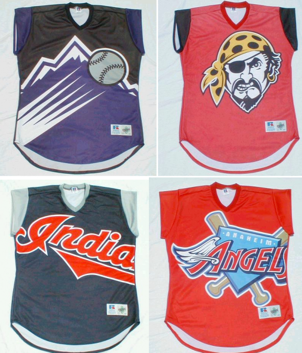
The most recent as well as by far the ugliest jerseys on this list, Major League Baseball produced these in 1999 for turn ahead the clock day. The league had the benefit of looking back on the entirety of the 1990s, and still came to the conclusion that the future of sports uniforms consisted of 1) making the logo as big as possible and 2) fuck it, who needs sleeves. Either somebody was nostalgic for days of exposed Cincinnati Reds biceps, or they figured it was another thing they could take from the NBA. These are godawful. That said, the Indians one actually was forward thinking, deftly anticipating that one day Chief Wahoo would have to go.
1990s Jacksonville Jaguars Jersey
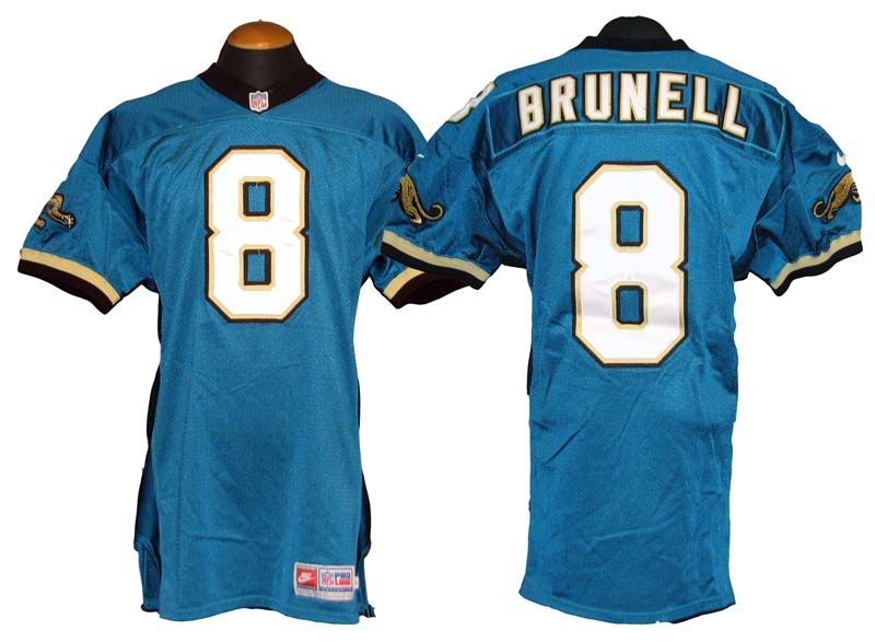
On this particular list Jacksonville stands out because, while ugly, their 1990s jerseys are actually more toned down than their current ones. Florida is going to Florida, whether you’re talking about the people, the politicians, even the sports teams. Every iteration of nearly every pro sports team jersey in Florida (Dolphins, Magic, and the Heat’s Vice uniforms excepted) is the Florida man of jerseys, stacking bad decision on top of bad decision until you end up with Jaguars unis that appear to be several generations of jerseys stitched together. Florida is every bad decision anybody has ever made, covered in a layer of bath salts. Those alternate Heat uniforms are gorgeous, though.
Bonus: 1995 and 1996 NBA All Star Game Jerseys


Maybe it was a result of all that teal and turquoise, maybe it was a celebration of the ascendance of chain restaurants, but the NBA went all in on Southwestern imagery for two years in the mid-90s. Sure, those games took place in Phoenix and San Antonio, but I prefer to believe that it was mostly about Chili’s.
Thoughts? Which jerseys would you have included (apart from the Pistons)?
